1. 什么是CoordinatorLayout
CoordinatorLayout是Android官方在Design包提供的控件,来自官方的解释是:
CoordinatorLayout is a super-powered FrameLayout
它主要用于两个方面:
- 当做普通的FrameLayout作为根布局使用
- 作为一个或者多个子View进行复杂交互的容器
CoordinatorLayout为我们提供了一个叫做Behavior的东西,我们基本上的复杂交互都是使用Behavior来协调完成。
先看看本文的最终成果:
2. 如何使用CoordinatorLayout
2.1 添加依赖
这里我选择的是26.0.2版本,至于为什么选择这个,是因为我使用的最多的就是这个版本,暂时没有发现一些其他的什么问题。
dependencies{
    implementation 'com.android.support:design:26.0.2'
}
自从 Android Studio3.0 以后,基本上都是改用了 implementation,而不是使用 compile ,主要原因是使用 implementation 不会产生依赖传递,这对于我们来说,减少了很多麻烦,比方说以前解决的重复依赖版本的问题。
2.2 布局中使用CoordinatorLayout
很简单的写了一下,现在只要是当做简单的FrameLayout来使用,内部只放了一个TextView,详情看以下代码:
<?xml version="1.0" encoding="utf-8"?>
<android.support.design.widget.CoordinatorLayout
    xmlns:android="http://schemas.android.com/apk/res/android"
    xmlns:tools="http://schemas.android.com/tools"
    android:layout_width="match_parent"
    android:layout_height="match_parent"
    tools:context="android.of.road.com.course1.CreateCoordinatorLayoutActivity">

    <TextView
        android:layout_width="wrap_content"
        android:layout_height="wrap_content"
        android:layout_gravity="center_horizontal"
        android:layout_marginTop="20dp"
        android:text="Hello CoordinatorLayout"
        android:textSize="20sp" />

</android.support.design.widget.CoordinatorLayout>
我们可以运行起来看看效果
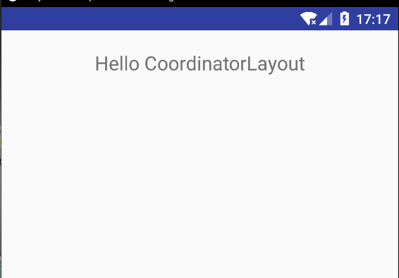
CoordinatorLayout的第一点作用就已经展现出来了,在我们要讲解它的第二点功能之前,我们需要准备一些预备知识。
3. 什么是AppBarLayout
AppBarLayout是一个垂直的 LinearLayout, 它实现了很多在material designs设计中提出的概念性交互功能,也就是【滚动手势】。
4. 如何使用AppBarLayout
4.1 例子1
AppBarLayout也是design包中的一个控件,所以在这里就不需要再添加依赖了。我们可以通过给它的子View进行setScrollFlags(int)或者直接在xml中增加属性app:layout_scrollFlags来设置它子View的滚动行为。
需要注意的是,AppBarLayout需要配合CoordinatorLayout进行使用,如果只是放到普通的ViewGroup中使用的话将无法实现它的效果。
<android.support.design.widget.CoordinatorLayout xmlns:android="http://schemas.android.com/apk/res/android"
    xmlns:app="http://schemas.android.com/apk/res-auto"
    xmlns:tools="http://schemas.android.com/tools"
    android:layout_width="match_parent"
    android:layout_height="match_parent"
    tools:context="android.of.road.com.course1.CreateAppBarLayoutActivity">

    <android.support.design.widget.AppBarLayout
        android:layout_width="match_parent"
        android:layout_height="wrap_content">

        <android.support.v7.widget.Toolbar
            android:layout_width="match_parent"
            android:layout_height="wrap_content"
            app:layout_scrollFlags="scroll|enterAlways"
            app:navigationIcon="@drawable/ic_arrow_back_white_24dp" />

    </android.support.design.widget.AppBarLayout>

    <android.support.v4.widget.NestedScrollView
        android:layout_width="match_parent"
        android:layout_height="match_parent"
        app:layout_behavior="@string/appbar_scrolling_view_behavior">

        <LinearLayout
            android:layout_width="match_parent"
            android:layout_height="500dp">

        </LinearLayout>

    </android.support.v4.widget.NestedScrollView>

</android.support.design.widget.CoordinatorLayout>
随着内容的滑动,ToolBar也跟随着滑动,详情看效果图:
4.2 app:layout_scrollFlags介绍
- enterAlways:向上滚动时视图将变为可见。
- enterAlwaysCollapsed:通常,当仅使用enterAlways时,工具栏将在向下滚动时继续扩展。如果声明了enterAlways并指定了minHeight,则还可以指定enterAlwaysCollapsed。使用此设置时,您的视图将仅显示在此最小高度。仅当滚动到达顶部时,视图才会扩展到其完整高度
- exitUntilCollapsed:当设置滚动标志时,向下滚动通常会导致整个内容移动。通过指定minHeight和exitUntilCollapsed,将在其余内容开始滚动并退出屏幕之前达到工具栏的最小高度
- Snap:使用此选项将确定仅在部分缩小视图时要执行的操作。如果滚动结束并且视图大小已减小到原始视图的小于50%,则此视图将返回其原始大小。尺寸大于其尺寸的50%,它将完全消失。
4.3 Behavior
Behavior这个名词看着陌生,但事实上我们经常简单,如:app:layout_behavior="@string/appbar_scrolling_view_behavior",这个一般是出现在使用Android Stuido创建Activty的时候自动创建的,他的作用是让使用这个属性的View在appbar下面滚动。而Behavior主要的使用方式其实是通过反射来实现的,我们在layout_behavior中并没有直接进行引用,而是写了包名+类名,所以Behavior是不能够被混淆的。
5. 例子
前面讲了那么都得概念,关于CollapsingToolbarLayout的使用在网络上已经写得烂大街了,所以在这里也就不做太多的概述,关于layout_scrollFlags的使用和介绍也是一样的,所以我们直接上手代码吧。
下面的小例子是为了实现一个简单的透明度渐变的toolbar和header的移动。先看看效果图吧:
5.1 分析
从图中可以看到,我们的标题栏是随着上下滑动而透明度渐变,头像在展开状态下处于居中状态,随着慢慢的滑动合上,头像会改变X轴和Y轴的坐标,最终移动到返回键的旁边。
5.2 开始编码
我们采用的做法是用AppBarLayout包裹一个CollapsingToolbarLayout,CollapsingToolbarLayout中放我们的背景图片,随着滑动收缩和关闭图片,下面是一个NestedScrollView,里面放LinearLayout和一大堆的CardView。
activity_transfer_header中的布局
<?xml version="1.0" encoding="utf-8"?>
<android.support.design.widget.CoordinatorLayout xmlns:android="http://schemas.android.com/apk/res/android"
    xmlns:app="http://schemas.android.com/apk/res-auto"
    xmlns:tools="http://schemas.android.com/tools"
    android:layout_width="match_parent"
    android:layout_height="match_parent"
    tools:context=".TransferHeaderActivity">

    <android.support.design.widget.AppBarLayout
        android:layout_width="match_parent"
        android:layout_height="wrap_content">

        <android.support.design.widget.CollapsingToolbarLayout
            android:id="@+id/mCollapsingToolbarLayout"
            android:layout_width="match_parent"
            android:layout_height="wrap_content"
            app:layout_scrollFlags="scroll|exitUntilCollapsed">

            <ImageView
                android:id="@+id/iv"
                android:layout_width="match_parent"
                android:layout_height="240dp"
                android:scaleType="fitXY"
                android:src="@mipmap/design"
                app:layout_collapseMode="parallax"
                app:layout_collapseParallaxMultiplier="0.9" />

        </android.support.design.widget.CollapsingToolbarLayout>

    </android.support.design.widget.AppBarLayout>

    <include layout="@layout/layout_tr_content" />

</android.support.design.widget.CoordinatorLayout>
其中我们CollapsingToolbarLayout的layout_scrollFlags使用的是scroll和exitUntilCollapsed,scroll是必需要设置的,不设置将无法滑动,exitUntilCollapsed可以让CollapsingToolbarLayout退出关闭。
ImageView的layout_collapseMode为parallax,代表ImageView滑动会有一个视差滚动的效果,而视差滚动的比值(layout_collapseParallaxMultiplier)是0.9。需要注意的是CollapsingToolbarLayout内部必需有一个铺满高度的VIew来做参考坐标,自定义Behavior才能够起作用。
layout_tr_content中的内容
<?xml version="1.0" encoding="utf-8"?>
<android.support.v4.widget.NestedScrollView xmlns:android="http://schemas.android.com/apk/res/android"
    xmlns:app="http://schemas.android.com/apk/res-auto"
    xmlns:tools="http://schemas.android.com/tools"
    android:layout_width="match_parent"
    android:layout_height="match_parent"
    android:scrollbars="none"
    app:layout_behavior="@string/appbar_scrolling_view_behavior"
    tools:showIn="@layout/activity_translucent_behavior">

    <LinearLayout
        android:layout_width="match_parent"
        android:layout_height="wrap_content"
        android:orientation="vertical">

        <android.support.v7.widget.CardView
            android:layout_width="match_parent"
            android:layout_height="100dp"
            android:layout_marginBottom="40dp"
            android:layout_marginLeft="40dp"
            android:layout_marginRight="40dp"
            app:cardElevation="3dp" />
    </LinearLayout>

</android.support.v4.widget.NestedScrollView>
好了,我们运行起来看看效果吧:
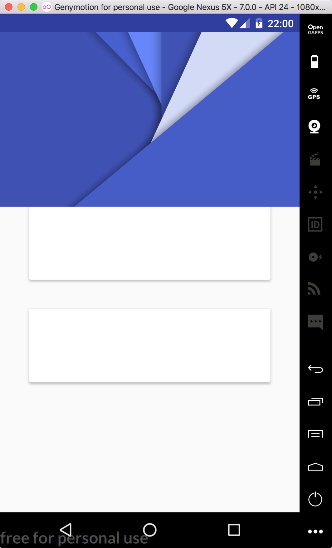
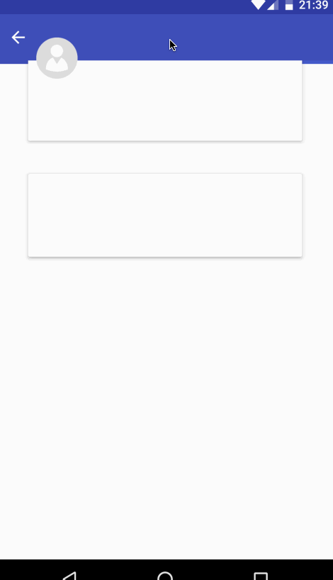
诶? 有没有发现效果不一样? 我们运行起来的是这样:
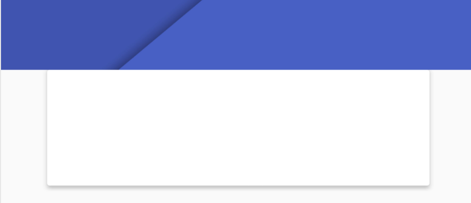
而我们效果图中的是这样:
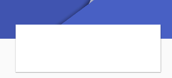
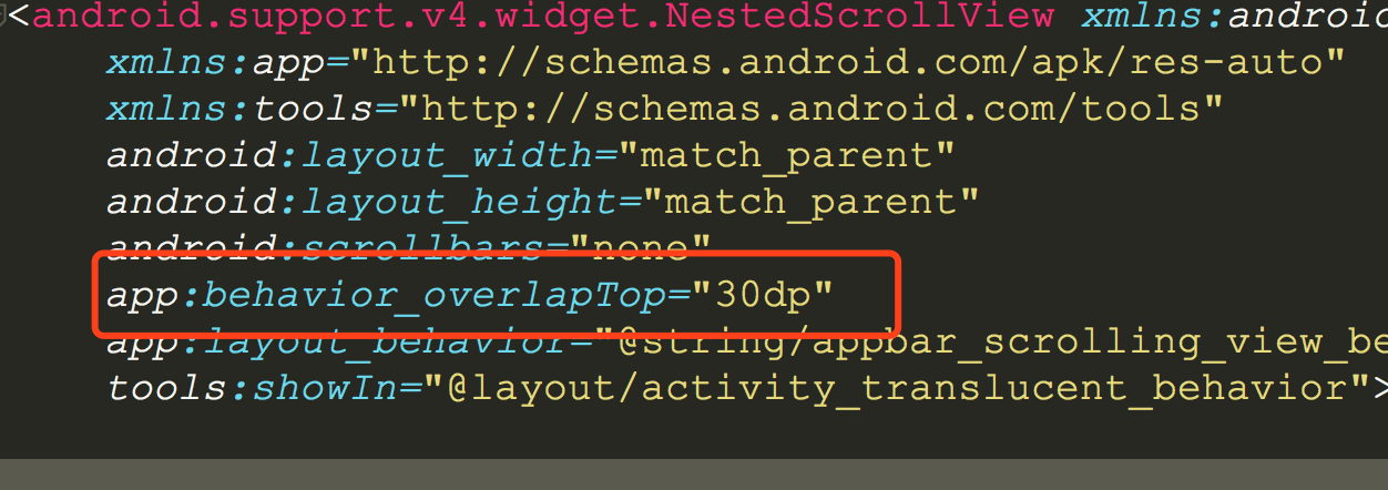
其实只需要在NestedScrollView中加上一个属性behavior_overlapTop,它会向上缩进赋值的高度:
5.3 实现透明Toolbar
创建TranslucentBehavior继承至CoordinatorLayout.Behavior。我们在Behavior中计算移动的Y轴和总高度的比例,然后计算alpha通道的值,设置Toolbar的背景颜色。
具体代码实现
public class TranslucentBehavior extends CoordinatorLayout.Behavior<Toolbar> {

    /**标题栏的高度*/
    private int mToolbarHeight = 0;

    public TranslucentBehavior(Context context, AttributeSet attrs) {
        super(context, attrs);
    }

    @Override
    public boolean layoutDependsOn(CoordinatorLayout parent, Toolbar child, View dependency) {
        return dependency instanceof TextView;
    }

    /**
     * 必须要加上  layout_anchor,对方也要layout_collapseMode才能使用
     */
    @Override
    public boolean onDependentViewChanged(CoordinatorLayout parent, Toolbar child, View dependency) {

        // 初始化高度
        if (mToolbarHeight == 0) {
            mToolbarHeight = child.getBottom() * 2;//为了更慢的
        }
        //
        //计算toolbar从开始移动到最后的百分比
        float percent = dependency.getY() / mToolbarHeight;

        //百分大于1,直接赋值为1
        if (percent >= 1) {
            percent = 1f;
        }

        // 计算alpha通道值
        float alpha = percent * 255;


        //设置背景颜色
        child.setBackgroundColor(Color.argb((int) alpha, 63, 81, 181));

        return true;
    }
}
在xml中进行引用:
<?xml version="1.0" encoding="utf-8"?>
<android.support.design.widget.CoordinatorLayout xmlns:android="http://schemas.android.com/apk/res/android"
    xmlns:app="http://schemas.android.com/apk/res-auto"
    xmlns:tools="http://schemas.android.com/tools"
    android:layout_width="match_parent"
    android:layout_height="match_parent"
    tools:context=".TransferHeaderActivity">

    <android.support.design.widget.AppBarLayout
        android:layout_width="match_parent"
        android:layout_height="wrap_content">

        <android.support.design.widget.CollapsingToolbarLayout
            android:id="@+id/mCollapsingToolbarLayout"
            android:layout_width="match_parent"
            android:layout_height="wrap_content"
            app:layout_scrollFlags="scroll|exitUntilCollapsed">

            <ImageView
                android:id="@+id/iv"
                android:layout_width="match_parent"
                android:layout_height="240dp"
                android:scaleType="fitXY"
                android:src="@mipmap/design"
                app:layout_collapseMode="parallax"
                app:layout_collapseParallaxMultiplier="0.9" />

        </android.support.design.widget.CollapsingToolbarLayout>

    </android.support.design.widget.AppBarLayout>

    <include layout="@layout/layout_tr_content" />
   <!--layout_anchor iv 才起作用-->
    <android.support.v7.widget.Toolbar
        android:id="@+id/tl"
        android:layout_width="match_parent"
        android:layout_height="wrap_content"
        app:layout_anchor="@id/iv"
        app:layout_behavior="android.of.road.com.behavior.TranslucentBehavior"
        app:navigationIcon="@drawable/ic_arrow_back_white_24dp" />

</android.support.design.widget.CoordinatorLayout>
需要注意的是:
- layout_behavior中放的的是全路径,错一个都不能正常工作
- Toolbar需要放在content之后
来看看效果吧:
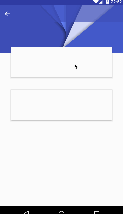
完美达成!!
5.4 头像移动
创建TransferHeaderBehavior继承CoordinatorLayout.Behavior,传入泛型是ImageView,这个ImageView就是我们的参考坐标View。
实现原理是:
- 先计算出header的X轴位置:父View的宽度/2 - header的宽度/2
- Y轴为父View的高度 - header的高度
- 不断使用滑动的父Y轴的距离来计算算header的X轴百分比和Y轴百分比
- 不断的更改X轴的距离即可
具体实现看代码:
public class TransferHeaderBehavior extends CoordinatorLayout.Behavior<ImageView> {

    /**
     * 处于中心时候原始X轴
     */
    private int mOriginalHeaderX = 0;
    /**
     * 处于中心时候原始Y轴
     */
    private int mOriginalHeaderY = 0;


    public TransferHeaderBehavior(Context context, AttributeSet attrs) {
        super(context, attrs);
    }

    @Override
    public boolean layoutDependsOn(CoordinatorLayout parent, ImageView child, View dependency) {
        return dependency instanceof Toolbar;
    }

    @Override
    public boolean onDependentViewChanged(CoordinatorLayout parent, ImageView child, View dependency) {
        // 计算X轴坐标
        if (mOriginalHeaderX == 0) {
            this.mOriginalHeaderX = dependency.getWidth() / 2 - child.getWidth() / 2;
        }
        // 计算Y轴坐标
        if (mOriginalHeaderY == 0) {
            mOriginalHeaderY = dependency.getHeight() - child.getHeight();
        }
        //X轴百分比
        float mPercentX = dependency.getY() / mOriginalHeaderX;
        if (mPercentX >= 1) {
            mPercentX = 1;
        }
        //Y轴百分比
        float mPercentY = dependency.getY() / mOriginalHeaderY;
        if (mPercentY >= 1) {
            mPercentY = 1;
        }

        float x = mOriginalHeaderX - mOriginalHeaderX * mPercentX;
        if (x <= child.getWidth()) {
            x = child.getWidth();
        }
        // TODO 头像的放大和缩小没做

        child.setX(x);
        child.setY(mOriginalHeaderY - mOriginalHeaderY * mPercentY);
        return true;
    }
}
在xml中引用
<?xml version="1.0" encoding="utf-8"?>
<android.support.design.widget.CoordinatorLayout xmlns:android="http://schemas.android.com/apk/res/android"
    xmlns:app="http://schemas.android.com/apk/res-auto"
    xmlns:tools="http://schemas.android.com/tools"
    android:layout_width="match_parent"
    android:layout_height="match_parent"
    tools:context=".TransferHeaderActivity">

    <android.support.design.widget.AppBarLayout
        android:layout_width="match_parent"
        android:layout_height="wrap_content">

        <android.support.design.widget.CollapsingToolbarLayout
            android:id="@+id/mCollapsingToolbarLayout"
            android:layout_width="match_parent"
            android:layout_height="wrap_content"
            app:layout_scrollFlags="scroll|exitUntilCollapsed">

            <ImageView
                android:id="@+id/iv"
                android:layout_width="match_parent"
                android:layout_height="240dp"
                android:scaleType="fitXY"
                android:src="@mipmap/design"
                app:layout_collapseMode="parallax"
                app:layout_collapseParallaxMultiplier="0.9" />

        </android.support.design.widget.CollapsingToolbarLayout>

    </android.support.design.widget.AppBarLayout>

    <include layout="@layout/layout_tr_content" />

    <android.support.v7.widget.Toolbar
        android:id="@+id/tl"
        android:layout_width="match_parent"
        android:layout_height="wrap_content"
        app:layout_anchor="@id/iv"
        app:layout_behavior="android.of.road.com.behavior.TranslucentBehavior"
        app:navigationIcon="@drawable/ic_arrow_back_white_24dp" />
    <!--layout_anchor iv 才起作用-->

    <ImageView
        android:layout_width="50dp"
        android:layout_height="50dp"
        android:layout_gravity="center_horizontal"
        android:elevation="5dp"
        android:src="@mipmap/default_header"
        app:layout_anchor="@id/iv"
        app:layout_behavior="android.of.road.com.behavior.TransferHeaderBehavior" />

</android.support.design.widget.CoordinatorLayout>
运行查看效果:
完美达成!!
6. 最后
TransferHeaderBehavior中遗留了一个todo:头像的缩小,这个留着下一章实现。
未完待续、敬请期待!
免为其难的关注一下公众号吧!!