3.7 ProgressBar
ProgressBar类官方文档地址:http://developer.android.com/reference/android/widget/ProgressBar.html
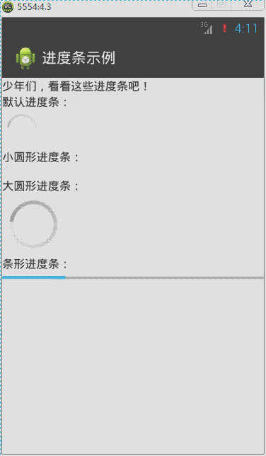
在Android应用开发中,ProgressBar(运行进度条)是比较常用到的组件,例如下载进度、安装程序进度、加载资源进度显示等。在Android中提供了两种样式来分别表示在不同状态下显示的进度条,下面来实现这两种样式。
默认进度条是圆形,通过style属性来指定系统进度条的大小:
style="?android:attr/progressBarStyleSmall",小圆形进度条
style="?android:attr/progressBarStyleLarge",大圆形进度条
如果需要将进度条显示为长条形,那么style必须设定为这种类型:
style="?android:attr/progressBarStyleHorizontal",长条形进度条
针对长条形进度条,还有几个常用属性:
android:max,设置进度条最大进度值
android:progress,设置进度条出事进度值。
android:secondaryProgress,设置底层(浅色)进度值
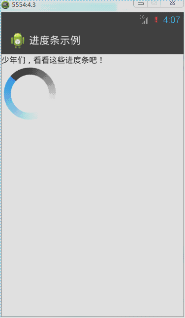
圆形显示进度条默认是动态,但是长条进度条却是静态的,那么修改源代码MainActivity实现长条进度条为动态显示:
ProgressBar类中常用函数如下所示:
getProgress();获取当前进度值;
setProgress();设置进度值;
getSecondaryProgress();获取底层进度值
setSecondaryProgress();设置底层进度值
getMax();获取当前最大进度值
在线程循环中对进度条的最大进度值与当前进度值进行判断处理,然后不断设置进度值进而达到动态进度值越来越大,或越来越小的动态效果。

<?xml version="1.0" encoding="utf-8"?>
<LinearLayout xmlns:android="http://schemas.android.com/apk/res/android"
    android:layout_width="match_parent"
    android:layout_height="match_parent"
    android:orientation="vertical" >

    <TextView
        android:layout_width="match_parent"
        android:layout_height="wrap_content"
        android:text="@string/txt_ProgressBar" />

    <TextView
        android:layout_width="wrap_content"
        android:layout_height="wrap_content"
        android:text="默认进度条:" />

    <ProgressBar
        android:id="@+id/pb1"
        android:layout_width="wrap_content"
        android:layout_height="wrap_content" />

    <TextView
        android:layout_width="wrap_content"
        android:layout_height="wrap_content"
        android:text="小圆形进度条:" />

    <ProgressBar
        android:id="@+id/pb2"
        style="?android:attr/progressBarStyleSmall"
        android:layout_width="wrap_content"
        android:layout_height="wrap_content" />

    <TextView
        android:layout_width="wrap_content"
        android:layout_height="wrap_content"
        android:text="大圆形进度条:" />

    <ProgressBar
        android:id="@+id/pb3"
        style="?android:attr/progressBarStyleLarge"
        android:layout_width="wrap_content"
        android:layout_height="wrap_content" />

    <TextView
        android:layout_width="wrap_content"
        android:layout_height="wrap_content"
        android:text="条形进度条:" />

    <ProgressBar
        android:id="@+id/pb4"
        style="?android:attr/progressBarStyleHorizontal"
        android:layout_width="match_parent"
        android:layout_height="wrap_content"
        android:max="100"
        android:progress="50"
        android:secondaryProgress="70" />

</LinearLayout>
import android.app.Activity;
import android.os.Bundle;
import android.widget.ProgressBar;

public class MainActivity extends Activity implements Runnable {
    private Thread th; // 声明一个线程
    private ProgressBar pb;// 声明一个进度条对象
    private Boolean stateChage = false;// 标识进度值的最大最小的状态

    @Override
    protected void onCreate(Bundle savedInstanceState) {
        super.onCreate(savedInstanceState);
        setContentView(R.layout.activity_main);
        // 实例化进度条对象
        pb = (ProgressBar) findViewById(R.id.pb4);
        th = new Thread(this);// 实例化线程对象
        th.start();// 启动线程
    }

    @Override
    public void run() {// 实现Runnable接口抽象函数
        while (true) {
            int current = pb.getProgress();// 得到当前的进度值
            int currentMax = pb.getMax();// 得到进度条的最大进度值
            // int secCurrent = pb.getSecondaryProgress();// 得到底层当前进度值
            // 一下代码实现进度值越大,越来越小的一个动态效果
            if (stateChage == false) {
                if (current >= currentMax) {
                    stateChage = true;
                } else {
                    // 设置进度值
                    pb.setProgress(current + 1);
                    // 设置底层进度值
                    pb.setSecondaryProgress(current + 1);
                }
            } else {
                if (current <= 0) {
                    stateChage = false;
                } else {
                    pb.setProgress(current - 1);
                }
            }
            try {
                Thread.sleep(50);
            } catch (InterruptedException e) {
                e.printStackTrace();
            }
        }
    }
}
自定义圆形进度条样式的方法:
方法1:通过一张图片填充android:indeterminateDrawable

准备图片: progress_load.png

在drawable下新建image_progress_01.xml文件
<?xml version="1.0" encoding="utf-8"?>
<rotate xmlns:android="http://schemas.android.com/apk/res/android"
    android:drawable="@drawable/progress_load"
    android:fromDegrees="0"
    android:pivotX="50%"
    android:pivotY="50%"
    android:toDegrees="360" />
在 \value\style.xml中定义myProgressBarStyle
<style name="myProgressBarStyle" >
  <item name="android:indeterminateDrawable">@drawable/image_progress_01</item>
  <item name="android:minWidth">100dip</item>
  <item name="android:maxWidth">100dip</item>
  <item name="android:minHeight">100dip</item>
  <item name="android:maxHeight">100dip</item>
</style>
最后在ProgressBar中使用我们自己定义的style,android:indeterminateDuration="700"指定图片旋转的速度,这样我们就可以根据自己的需要来定义ProgressBar的样式。
 <ProgressBar
        android:id="@+id/pb1"
        style="@style/myProgressBarStyle"
        android:layout_width="wrap_content"
        android:layout_height="wrap_content"
        android:indeterminateDuration="700" />
方法2:定义一个动画来实现
准备图片:photo1.jpg、photo2.jpg、photo3.jpg、photo4.jpg、photo5.jpg

定义res/anim/image_progress.xml如下:
<?xml version="1.0" encoding="utf-8"?>
<animation-list xmlns:android="http://schemas.android.com/apk/res/android" android:oneshot="false">
     <item android:duration="1000" android:drawable="@drawable/photo1" />
  <item android:duration="1000" android:drawable="@drawable/photo2" />
  <item android:duration="1000" android:drawable="@drawable/photo3" />
  <item android:duration="1000" android:drawable="@drawable/photo4" />
  <item android:duration="1000" android:drawable="@drawable/photo5" />
</animation-list>
在我们定义的style中引入<item name="android:indeterminateDrawable">@anim/image_progress.xml</item>
<style name="myProgressBarStyle2" >
  <item name="android:indeterminateDrawable">@anim/image_progress</item>
  <item name="android:minWidth">200dip</item>
  <item name="android:maxWidth">200dip</item>
  <item name="android:minHeight">200dip</item>
  <item name="android:maxHeight">200dip</item>
</style>
最后在ProgressBar中使用我们自己定义的style
style="@style/myProgressBarStyle2"
方法3:自定义颜色来实现
定义res/drawable/image_progress_02.xml如下:
<?xml version="1.0" encoding="utf-8"?>
<rotate xmlns:android="http://schemas.android.com/apk/res/android"
    android:fromDegrees="0"
    android:pivotX="50%"
    android:pivotY="50%"
    android:toDegrees="360" >
    <shape
        android:innerRadiusRatio="3"
        android:shape="ring"
        android:thicknessRatio="8"
        android:useLevel="false" >
        <gradient
            android:centerColor="#FFFFFF"
            android:centerY="0.50"
            android:endColor="#1E90FF"
            android:startColor="#000000"
            android:type="sweep"
            android:useLevel="false" />
    </shape>
</rotate>
在我们定义的style中引入<item name="android:indeterminateDrawable">@drawable/image_progress_02</item>
<style name="myProgressBarStyle3" >
  <item name="android:indeterminateDrawable">@drawable/image_progress_02</item>
  <item name="android:minWidth">100dip</item>
  <item name="android:maxWidth">100dip</item>
  <item name="android:minHeight">100dip</item>
  <item name="android:maxHeight">100dip</item>
</style>
最后在ProgressBar中使用我们自己定义的style
style="@style/myProgressBarStyle3"
自定义长条形进度条样式:

原理:在XML文件中分别定义进度条背景、第一进度颜色、第二进度颜色,然后在ProgressBar的android:progressDrawable属性应用即可。
先在drawable下建立progressbar_style.xml文件,内容如下:
<?xml version="1.0" encoding="utf-8"?>
<layer-list xmlns:android="http://schemas.android.com/apk/res/android" >
     <item android:id="@android:id/background">
        <shape>
            <corners android:radius="5.0dip" />
            <gradient android:startColor="#656666" android:endColor="#dbdedf" android:angle="270.0" android:centerY="0.75" android:centerColor="#bbbbbc" />
        </shape>
    </item>
    <item android:id="@android:id/secondaryProgress">
        <clip>
            <shape>
                <corners android:radius="8.0dip" />
                <gradient android:startColor="#e71a5e" android:endColor="#6c213a" android:angle="90.0" android:centerY="0.75" android:centerColor="#ac6079" />
            </shape>
        </clip>
    </item>
    <item android:id="@android:id/progress">
        <clip>
            <shape>
                <corners android:radius="8.0dip" />
                <gradient android:startColor="#464647" android:endColor="#2d9ae7" android:angle="270.0" />
            </shape>
        </clip>
    </item>

</layer-list>
分别定义背景,第一进度颜色,第二进度颜色gradient定义的是渐变,corners定义的是圆角布局中:
<ProgressBar
        android:id="@+id/pb1"
        style="?android:attr/progressBarStyleHorizontal"
        android:layout_width="match_parent"
        android:layout_height="wrap_content"
        android:max="100"
        android:progress="50"
        android:progressDrawable="@drawable/image_progress_03"
        android:secondaryProgress="70" />
MainActivity.java文件:
import android.app.Activity;
import android.os.Bundle;
import android.widget.ProgressBar;

public class MainActivity extends Activity implements Runnable {
    private Thread th; // 声明一个线程
    private ProgressBar pb;// 声明一个进度条对象
    private Boolean stateChage = false;// 标识进度值的最大最小的状态

    @Override
    protected void onCreate(Bundle savedInstanceState) {
        super.onCreate(savedInstanceState);
        setContentView(R.layout.activity_main);
        // 实例化进度条对象
        pb = (ProgressBar) findViewById(R.id.pb1);
        th = new Thread(this);// 实例化线程对象
        th.start();// 启动线程
    }

    @Override
    public void run() {// 实现Runnable接口抽象函数
        while (true) {
            int current = pb.getProgress();// 得到当前的进度值
            int currentMax = pb.getMax();// 得到进度条的最大进度值
            // int secCurrent = pb.getSecondaryProgress();// 得到底层当前进度值
            // 一下代码实现进度值越大,越来越小的一个动态效果
            if (stateChage == false) {
                if (current >= currentMax) {
                    stateChage = true;
                } else {
                    // 设置进度值
                    pb.setProgress(current + 1);
                    // 设置底层进度值
                    pb.setSecondaryProgress(current + 1);
                }
            } else {
                current =0;
                pb.setProgress(current);
                stateChage = false;
            }
            try {
                Thread.sleep(50);
            } catch (InterruptedException e) {
                e.printStackTrace();
            }
        }
    }
}
3.8 Seekbar
SeekBar类官方文档地址:http://developer.android.com/reference/android/widget/SeekBar.html
SeekBar(拖动条)的外观类似长条进度条。Android手机上最常见到拖动条的地方就是在播放音乐的时候,当用户在拖动条上任意拖动可以调整音乐播放的时间段;调整铃声音量大小界面也是利用拖动条与用户进行交互。下面来学习如何定义和监听拖动条事件。
对拖动条进行监听的是setOnSeekBarChangeListener这个接口,这里使用的内部类实现绑定监听,然后重写接口的三个函数:
onStopTrackingTouch:当用户对拖动条的拖动动作完成时触发;
onStartTrackingTouch:当用户对拖动条进行拖动时触发;
onProgressChanged:当拖动条的值发生改变时触发。
其实拖动条类似长条提示进度条,也拥有setMax()、setProgress()、setSecondaryProgress()这些函数。
简单示例如下:
 .
.
<?xml version="1.0" encoding="utf-8"?>
<LinearLayout xmlns:android="http://schemas.android.com/apk/res/android"
    android:layout_width="match_parent"
    android:layout_height="match_parent"
    android:orientation="vertical" >

    <TextView
        android:id="@+id/tv"
        android:layout_width="match_parent"
        android:layout_height="wrap_content"
        android:text="@string/txt_SeekBar" />

    <SeekBar
        android:id="@+id/skb"
        android:layout_width="match_parent"
        android:layout_height="wrap_content" />

</LinearLayout>
import android.app.Activity;
import android.os.Bundle;
import android.widget.SeekBar;
import android.widget.SeekBar.OnSeekBarChangeListener;
import android.widget.TextView;

public class MainActivity extends Activity {
    private SeekBar skb;
    private TextView tv;

    @Override
    protected void onCreate(Bundle savedInstanceState) {
        super.onCreate(savedInstanceState);
        setContentView(R.layout.activity_main);
        skb = (SeekBar) findViewById(R.id.skb);
        tv = (TextView) findViewById(R.id.tv);
        skb.setOnSeekBarChangeListener(new OnSeekBarChangeListener() {

            @Override
            public void onStopTrackingTouch(SeekBar seekBar) {
                tv.setText("“拖动条”完成拖动。");
            }

            @Override
            public void onStartTrackingTouch(SeekBar seekBar) {
                tv.setText("“拖动条”拖动中。。。");
            }

            @Override
            public void onProgressChanged(SeekBar seekBar, int progress,
                    boolean fromUser) {
                tv.setText("当前“拖动条”的值为" + progress);
            }
        });
    }

}
自定义拖动条样式:
SeekBar的系统有提供一种样式如下:
style="@android:style/Widget.SeekBar"

在android的源码目录\platforms\android-18\data\res\values\styles.xml下,我找到了Widget.SeekBar的代码
<style name="Widget.SeekBar">
        <item name="android:indeterminateOnly">false</item>
        <item name="android:progressDrawable">@android:drawable/progress_horizontal</item>
        <item name="android:indeterminateDrawable">@android:drawable/progress_horizontal</item>
        <item name="android:minHeight">20dip</item>
        <item name="android:maxHeight">20dip</item>
        <item name="android:thumb">@android:drawable/seek_thumb</item>
        <item name="android:thumbOffset">8dip</item>
        <item name="android:focusable">true</item>
        <item name="android:mirrorForRtl">true</item>
    </style>
这里最重要的几个属性:
        <!-- 背景,进度条,次进度条的设置。 -->
        <item name="android:progressDrawable">@android:drawable/progress_horizontal</item>
        <!-- 背景,进度条,次进度条的设置【进度不确定】。 -->
        <item name="android:indeterminateDrawable">@android:drawable/progress_horizontal</item>
        <!-- 拖拽的图标。 -->
        <item name="android:thumb">@android:drawable/seek_thumb</item>
上面有indeterminate这个概念,是指进度不确定。这种情形下,进度会来回快闪。Seekbar默认样式是进度确定的,拖拽到具体位置就停止。图片资源progress_horizontal相当关键,它不是单一的图片。
在\platforms\android-18\data\res\drawable下,有progress_horizontal.xml:
<?xml version="1.0" encoding="utf-8"?>
<layer-list xmlns:android="http://schemas.android.com/apk/res/android" >

    <item android:id="@android:id/background">
        <shape>
            <corners android:radius="5dip" />

            <gradient
                android:angle="270"
                android:centerColor="#ff5a5d5a"
                android:centerY="0.75"
                android:endColor="#ff747674"
                android:startColor="#ff9d9e9d" />
        </shape>
    </item>
    <item android:id="@android:id/secondaryProgress">
        <clip>
            <shape>
                <corners android:radius="5dip" />

                <gradient
                    android:angle="270"
                    android:centerColor="#80ffb600"
                    android:centerY="0.75"
                    android:endColor="#a0ffcb00"
                    android:startColor="#80ffd300" />
            </shape>
        </clip>
    </item>
    <item android:id="@android:id/progress">
        <clip>
            <shape>
                <corners android:radius="5dip" />

                <gradient
                    android:angle="270"
                    android:centerColor="#ffffb600"
                    android:centerY="0.75"
                    android:endColor="#ffffcb00"
                    android:startColor="#ffffd300" />
            </shape>
        </clip>
    </item>

</layer-list>
上面其实就是三张自定义色彩渐变的图片。
我们可以依葫芦画瓢定义自己的三张图片(背景图有点淡,gif截图看不清楚,不过大家知道是那样就行了):

my_seekbar.xml
<?xml version="1.0" encoding="utf-8"?>
<layer-list xmlns:android="http://schemas.android.com/apk/res/android" >

    <!-- 背景样式 -->
    <item
        android:id="@android:id/background"
        android:drawable="@drawable/my_seekbar_no">
    </item>
    <!-- 次拖动条样式 -->
    <item android:id="@android:id/secondaryProgress">
        <scale
            android:drawable="@drawable/my_seekbar_back"
            android:scaleWidth="100%" />
    </item>
    <!-- 拖动后的样式 -->
    <item android:id="@android:id/progress">
        <scale
            android:drawable="@drawable/my_seekbar_sh"
            android:scaleWidth="100%" />
    </item>

</layer-list>
<style name="mySeekBar">
        <item name="android:minHeight">20dip</item>
        <item name="android:maxHeight">20dip</item>
        <item name="android:progressDrawable">@drawable/my_seekbar</item>
        <item name="android:indeterminateDrawable">@drawable/my_seekbar</item>
        <item name="android:thumb">@drawable/ic_launcher</item>
        <item name="android:thumbOffset">8dip</item>
    </style>
<SeekBar
        android:id="@+id/skb"
         style="@style/mySeekBar"
        android:layout_width="match_parent"
        android:layout_height="wrap_content"
        android:secondaryProgress="50"
        android:max="100"
        android:progress="10" />
拖拽的小图标是由thumb属性决定的。只要搞清楚以上的东东,SeekBar做成什么样就看自己了。