前言
当我们以position:absolute之名让元素脱离Normal flow的控制后,以为通过left和top属性值即可让元素得以无限的自由时,却发现还有各种神秘的力量左右着它的来去,于是我们意识到自己力量的微弱,开始迷茫不前。
后来有幸拾到各路前辈高人的秘笈,终于打通任督二脉,记录在案以便日后查阅。
以Normal flow为基础
Q:不是说好以左上角为原点(0,0)吗?怎么top:auto;right:auto;bottom:auto;left:auto;时的效果和Normal flow中的是一样的?
<style type="text/css">
  #parent{
    background: blue;
  }
  #sibling{
    text-align: center;
    line-height: 100px;
    margin: 0 20px;
    height: 100px;
    background: red;
  }
  #protagonist{
    text-align: center;
    line-height: 100px;
    width: 200px;
    height: 100px;
    background: yellow;
    position: absolute;
  }
</style>
<div id="parent">
  <div id="sibling">position:static</div>
  <div id="protagonist">position:absolute</div>
</div>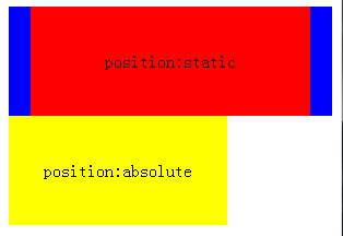
A:那是因为Absolute positioning在初始化状态时(top:auto;right:auto;bottom:auto;left:auto;),浏览器会生成一个看不见的采用Normal flow定位的虚拟盒子(hypothetical box),若虚拟盒子对应的盒子没有设置top/right/bottom/left属性值,则该盒子将与虚拟盒子重叠。
因此当我们仅仅设置position:absolute时,呈现出来的效果是跟position:static是无区别的。那这时我们会有两个疑问了,1. 既然top/right/bottom/left等默认值为auto,那实际计算值是多少呢?2. 假如显示设置top/right/bottom/left为特定数值后,那效果又是如何的呢?
若要回答上述问题,则先要理解定位参考系。一说起定位我们必须找到对应的参考系,如相对定位那样望文生义就知道它对应着某个参考系,而绝对定位则隐晦得多,咋看之下会让我们忽视参考系的重要性,然后糊里糊涂地理解和解读它呈现的效果。
绝对定位的参考系就是盒子所在的containing block,下面我们来深入一下吧!
定位参考系——containing block
不管采用的是Normal flow、Floats还是Absolute positioning,总之定位的参考系就是一个名为containing block的四方盒子,但不同的position scheme会对应不同containing block。就Absolute positioning而言,首先会寻找最近的一个position:relative/fixed/absolute的父容器元素,若找到且父容器为block-level element则以父容器的的padding box作为containing block,若父容器为inline-level element则根据父容器的directionCSS属性值决定containing block;若一个都找不到则会以initial containing block作为其的containing block。
更多关于containing block的信息可参考《CSS魔法堂:不得不说的Containing Block》
因此top/right/bottom/left的实际值则是相对于containing block而言,我们可以通过el.offsetLeft/Top来获取top和left的实际值。
绝对定位的奥义——top/right/bottom/left+box model
也许大家都见过以下这种水平垂直居中方式(IE7/6/5.5下均无效)
    <style type="text/css">
      #parent{
        background: blue;
        width: 200px;
        height: 200px;
        position: relative;
      }
      #protagonist{
        background: yellow;
        width: 100px;
        height: 100px;

        position: absolute;
        top: 0;
        right: 0;
        bottom: 0;
        left: 0;
    margin: auto;
      }
    </style>
    <div id="parent">
      <div id="protagonist"></div>
    </div>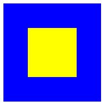
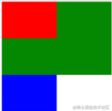
为啥简单设置top/right/bottom/left:0;margin:auto就轻松搞定这么难搞的水平垂直居中呢?请看下图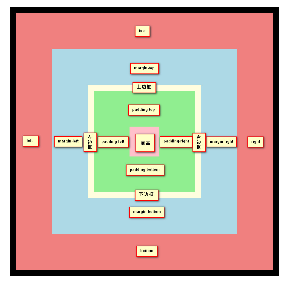
当盒子采用绝对定位后,其top/right/bottom/left和box model以占满整个containing block为目的,除非每个属性均设置的特定数值导致整体宽度或高度均小于containing block的宽度或高度。也就是得到以下两个等式:
- 垂直方向:
'top' + 'margin-top' + 'border-top-width' + 'padding-top' + 'height' + 'padding-bottom' + 'border-bottom-width' + 'margin-bottom' + 'bottom' = height of containing block - 水平方向:
'left' + 'margin-left' + 'border-left-width' + 'padding-left' + 'width' + 'padding-right' + 'border-right-width' + 'margin-right' + 'right' = width of containing block
然后一切玄机则蕴藏在auto这个属性值上了。
其中垂直方向上top/margin-top/height/margin-bottom/bottom可以设置为auto,而水平方向上则是left/margin-left/width/margin-right/right可以设置为auto。
对于non-replaced element的垂直方向等式
margin-top/bottom设置为auto时,实际值自动分配的情况
- top/height/bottom均不为auto时,那么margin-top/bottom两者的实际值相等,且足以满足等式1。
margin-top/bottom设置为auto时,实际值为0的情况
- top/height/bottom均为auto时,height的值由其子元素决定。top/bottom的值则根据虚拟盒子来决定,最终让定位效果如同采用
position:static一般,反正要让等式1成立。 - top/bottom均不为auto,而height为auto时,height会自动计算以满足等式1。
- 其他情况height由子元素或自身属性值决定,top/bottom由自身属性值或以满足等式1来决定实际值。
注意:top/auto/bottom默认值为auto,而margin-top/bottom默认值为0。
对于non-replaced element的水平方向等式
margin-left/right设置为auto时,实际值自动分配的情况
- left/width/right均不为auto时,那么margin-left/right两者的实际值相等,且足以满足等式2。
margin-left/right设置为auto时,实际值为0的情况
- left/width/right均为auto时,width的值由其子元素决定。left/right的值则根据direction的值来决定,最终让定位效果如同采用
position:static一般反,正要让等式2成立。 - left/right均不为auto,而width为auto时,width会自动计算以满足等式2。
- 其他情况width由子元素或自身属性值决定,left/right由自身属性值或以满足等式2来决定实际值。
注意:left/width/right默认值为auto,而margin-left/right默认值为0。
对于replaced element
由于replaced element自身有固有的width/height,因此当设置width:auto;height:auto时,其实际值就是元素固有的width/height。也就是width/height不存在为满足等式2和1动态扩展/缩小实际值的情况。结果就是除"2. top/bottom均不为auto,而height为auto时,height会自动计算以满足等式1。"和"2. left/right均不为auto,而width为auto时,width会自动计算以满足等式2。"两条不满足外,其他情况均一致。
注意,IE5.5/6/7下会有以下例外:
- left/margin-left/margin-right/right均不为auto而width为auto时,IE5.5下width的实际值将由子元素决定;
- top/margin-top/margin-bottom/bottom均不为auto而height为auto时,IE5.5下height的实际值将由子元素决定;
- left/width/right均不为auto,而margin-left/right为auto时,IE5.5/6/7下margin-left/right的实际值为0;
- top/height/bottom均不为auto,而margin-top/bottom为auto时,IE5.5/6/7下margin-top/bottom的实际值为0.
Fixed positioning——Absolute positioning的子类
对于position:fixed其实也属于Absolute positioning,但它参考系永远是由Viewport所产生的containing block而已,其他均与上述内容一致。
注意:由Viewport所产生的containing block与initail containing block是不同的详情请参考《CSS魔法堂:不得不说的Containing Block》
<style type="text/css">
  body{
    background: blue;
  }
  #protagonist{
    background: yellow;
    width: 100px;
    height: 100px;

    position: fixed;
    top: 0;
    right: 0;
    bottom: 0;
    left: 0;
    margin: auto;
   }
</style>
<div id="protagonist">fsjohnhuang</div>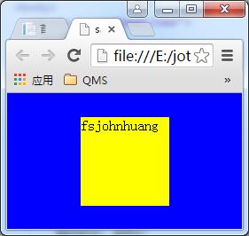
注意:IE6不支持position:fixed
总结
若有纰漏,望各位指正,谢谢!
尊重原创,转载请注明来自:http://www.cnblogs.com/fsjohnhuang/p/5358587.html^_^肥子John
感谢
深入理解CSS绝对定位
10 Visual formatting model details
KB012: 绝对定位( Absolute positioning )
https://www.w3.org/TR/CSS21/visuren.html#fixed-positioning
如果您觉得本文的内容有趣就扫一下吧!捐赠互勉!


公告
作品:


position: absolute;
top: 0;
right: 0;
bottom: 0;
left: 0;
margin: auto;