旋转的地球
实现原理:外层的轮廓是球形,里层包含一张世界地图背景,按照一定的时间匀速运动。
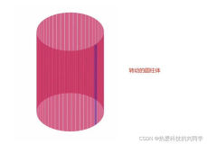
一、画轮廓
支持css3属性border-radius可以其属性,制作球形。
ie6-ie8采用蒙版效果。mask样式中将background设置一张中间为圆形全透明的png8图片。采用ie识别hack,*包括(ie6,ie7),\0包括(ie8)。
备注:因为上传到博客园中相册中的图片会被修改,所以在ie上看到的效果不对。可以将代码拷贝到本机上并制作一张相同的png8遮罩图片即可,此时运行便能看到效果。
#content{width: 300px; height: 300px; border-radius: 150px; overflow:hidden; margin: 80px auto 0px;  position: relative;}
#mask{width: 300px; height: 300px; position: absolute; top: 0px; left: 0px;
     *background: url(http://images.cnblogs.com/cnblogs_com/kuikui/354173/r_round.png) center no-repeat;
     background: url(http://images.cnblogs.com/cnblogs_com/kuikui/354173/r_round.png) center no-repeat\0;
     z-index:999}
二、地球旋转
将box设置为相对容器绝对定位,并在box中放两个img标签同样绝对定位。采用两个img的作用是当第一个图片旋转到最后的时候,不会出现空白不连贯的现象。
html结构部分:
<div id="box">
       <img class="img1" alt="" src="http://images.cnblogs.com/cnblogs_com/kuikui/354173/r_earth.jpg" />
       <img class="img2" alt="" src="http://images.cnblogs.com/cnblogs_com/kuikui/354173/r_earth.jpg" />
</div>
css样式部分:
#box{position: absolute; left:0px; top: 0px;}
#box img{width:800px; height: 300px;}
#box .img1{position: absolute; top: 0px; left: 0px;}
#box .img2{position: absolute;top:0px; left: 800px;}
通过控制box的left属性的变化,实现地球旋转的效果。
js代码:
 function moving(){
     auto = setInterval(function(){
         step--;
         if(oBox.offsetLeft<=-oBoxImgW){
             step=0;
          }
          oBox.style.left=step+"px";
     },60);
 }
三、鼠标移动上,停止旋转
如果支持css3的border-radius属性,在父容器上使用事件onmouseover为其添加clearInterval方法即可。
但是在ie6-ie8上鼠标移动到父容器中的空白部分地球便停止了运动。
于是采用为父容器添加onmousemove事件,非ie6-ie8依然使用clearInterval方法。
ie6-ie8通过计算坐标的位置来判断是否在这个圆形轮廓内。鼠标指针在触发事件元素内的坐标位置减去圆形的坐标位置的平方和小于圆的半径的平方时,说明鼠标在圆形轮廓内,地球便地址运动。
js代码:
content.onmousemove=function(event){
   if(!(navigator.appVersion.match(/9./i)=="9.")&&(navigator.appVersion.match(/MSIE/gi)=="MSIE")){
       event = event || window.event;
       var x = event.offsetX;
       var y = event.offsetY;
       var tmp =Math.abs(x-150)*Math.abs(x-150)+Math.abs(y-150)*Math.abs(y-150);
       if(tmp<150*150){
          clearInterval(auto);
       }
   }
   else{
      clearInterval(auto);
   }
}
效果图:
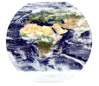
旋转的地球示例:
<!DOCTYPE html> <html> <head> <title>旋转的地球</title> <meta http-equiv="Content-Type" content="text/html; charset=UTF-8"> <style type="text/css"> *{margin: 0px;padding: 0px;} #content{width: 300px; height: 300px; border-radius: 150px; overflow:hidden; margin: 80px auto 0px; position: relative;} #mask{width: 300px; height: 300px; position: absolute; top: 0px; left: 0px; *background: url(http://images.cnblogs.com/cnblogs_com/kuikui/354173/r_round.png) center no-repeat;background: url(http://images.cnblogs.com/cnblogs_com/kuikui/354173/r_round.png) center no-repeat\0; z-index:999} #box{position: absolute; left:0px; top: 0px;} #box img{width:800px; height: 300px;} #box .img1{position: absolute; top: 0px; left: 0px;} #box .img2{position: absolute;top:0px; left: 800px;} </style> </head> <body> <div id="content"> <div id="mask"></div> <div id="box"> <img class="img1" alt="" src="http://images.cnblogs.com/cnblogs_com/kuikui/354173/r_earth.jpg" /> <img class="img2" alt="" src="http://images.cnblogs.com/cnblogs_com/kuikui/354173/r_earth.jpg" /> </div> </div> <script type="text/javascript"> function $(id){return document.getElementById(id);} var content = $("content"); var oBox = $("box"); var oBoxImg = oBox.getElementsByTagName("img")[0]; var oBoxImgW = oBoxImg.clientWidth; var step = 0; var auto; function moving(){ auto = setInterval(function(){ step--; if(oBox.offsetLeft<=-oBoxImgW){ step=0; } oBox.style.left=step+"px"; },60); } moving(); content.onmousemove=function(event){ if(!(navigator.appVersion.match(/9./i)=="9.")&&(navigator.appVersion.match(/MSIE/gi)=="MSIE")){ event = event || window.event; var x = event.offsetX; var y = event.offsetY; var tmp =Math.abs(x-150)*Math.abs(x-150)+Math.abs(y-150)*Math.abs(y-150); if(tmp<150*150){ clearInterval(auto); } } else{ clearInterval(auto); } } content.onmouseout=function(){ moving(); } </script> </body> </html>
由于chrome下,绝对定位会浮现在相对定位父容器的上方。
改变实现原理采用margin-left属性,修正了chrome浏览器下显示没能显示为圆形。
添加了向左向右两个按钮,同时增加了阴影效果。
===========================================
待完成ie6-ie8下,实现圆形效果。
实现原理,为父容器增加相对定位。子元素采用绝对定位,控制left属性。同时插入div标签蒙版层(png8)图片。
这样便可以实现ie6-ie8下圆形的效果。
<!DOCTYPE html> <html> <head> <title>旋转的地球</title> <meta http-equiv="Content-Type" content="text/html; charset=UTF-8"> <style type="text/css"> *{margin:0px;padding: 0px;} #content{width: 300px; height: 300px; border-radius: 150px;overflow: hidden; margin: 80px auto 20px; box-shadow: -1px 1px 1px #000000;} #box{width: 1200px; height: 300px; margin-left: -300px; margin-top: 0px;} .options{text-align: center;} .options input{padding:3px 15px; cursor: pointer;} </style> </head> <body> <div id="content"> <div id="box"> <img width="1200" height="300" alt="" src="http://images.cnblogs.com/cnblogs_com/kuikui/354173/r_mearth.jpg" /> </div> </div> <div class="options"><input id="mleft" style="margin-right: 40px;" type="button" value="向左" /><input id="mright" type="button" value="向右" /></div> <script type="text/javascript"> function $(id){return document.getElementById(id);} var content = $("content"); var oBox = $("box"); var mleft = $("mleft"); var mright = $("mright"); var step = -300; var bstep = true; var auto; function moving(){ auto = setInterval(function(){ if(bstep){ step--; } else{ step++; } if(step<-900){ step=-300; } if(step>-300){ step=-900; } oBox.style.marginLeft = step+"px"; },15); } moving(); content.onmousemove=function(event){ clearInterval(auto); } content.onmouseout=function(){ moving(); } mleft.onclick=function(){ bstep = true; content.style.boxShadow="-1px 1px 1px #000000"; content.style.box_Shadow="-1px 1px 1px #000000"; } mright.onclick = function(){ bstep = false; content.style.boxShadow="1px 1px 1px #000000"; content.style.box_Shadow="1px 1px 1px #000000"; } </script> </body> </html>
完善了旋转的地球,模拟3d可以为圆心轮廓增加一层暗透明阴影。
<!DOCTYPE html>
<html>
    <head>
        <title>旋转的地球</title>
        <meta http-equiv="Content-Type" content="text/html; charset=UTF-8">
        <style type="text/css">
            *{margin:0px;padding: 0px;}
            #content{width: 300px; height: 300px; border-radius: 150px;overflow: hidden; margin: 80px auto 20px;
                     box-shadow: -1px 1px 1px #000000;  position:relative\0; *position:relative;}
            #mask{width: 300px\0; height: 300px\0; *width: 300px; *height: 300px;  z-index:999;
                  position: absolute\0; top: 0px\0; left: 0px\0;
                  background: url(http://images.cnblogs.com/cnblogs_com/kuikui/354173/r_round.png) center no-repeat\0;
                  *position: absolute; *top: 0px; *left: 0px;
                  *background: url(http://images.cnblogs.com/cnblogs_com/kuikui/354173/r_round.png) center no-repeat;
            }
            #box{width: 1200px; height: 300px; margin-left: -300px; margin-top: 0px;
                 margin-left: 0px\0;position: absolute\0; top: 0px\0; left: -300px\0;
                 *margin-left: 0px; *position: absolute; *top: 0px; *left: -300px;

            }
            .options{text-align: center;}
            .options input{padding:3px 15px; cursor: pointer;}
        </style>
    </head>
    <body>
        <div id="content">
            <div id="mask"></div>
            <div id="box">
                <img width="1200" height="300" alt="" src="http://images.cnblogs.com/cnblogs_com/kuikui/354173/r_mearth.jpg" />
            </div>
        </div>
        <div class="options">
        <input id="mleft" style="margin-right: 40px;" type="button" value="向左" />
        <input id="mright" type="button" value="向右" />
    </div>
        <script type="text/javascript">
            function $(id){return document.getElementById(id);}
            function isIE(){
                if(navigator.appVersion.match(/MSIE/gi)=="MSIE"){
                    return true;
                }
                else{
                    return false;
                }
            }
            function isIE6_8(){
                if(!(navigator.appVersion.match(/9./i)=="9.")&&isIE()){
                    return true;
                }
                else{
                    return false;
                }
            }


            var content = $("content");
            var oBox = $("box");
            var mleft = $("mleft");
            var mright = $("mright");
            var step = -300;
            var bstep = true;
            var auto;
            function moving(){
                auto = setInterval(function(){
                    if(bstep){
                        step--;
                    }
                    else{
                        step++;
                    }
                    if(step<-900){
                        step=-300;
                    }
                    if(step>-300){
                        step=-900;
                    }

                    if(!isIE6_8()){
                        oBox.style.marginLeft = step+"px";
                    }
                    else{
                        oBox.style.left=step+"px";
                    }
                },15);
            }

            moving();

            content.onmousemove=function(event){
                if(isIE6_8()){
                    event = event || window.event;
                    var x = event.offsetX;
                    var y = event.offsetY;
                    var tmp =Math.abs(x-150)*Math.abs(x-150)+Math.abs(y-150)*Math.abs(y-150);
                    if(tmp<150*150){
                        clearInterval(auto);
                    }
                }
                else{
                    clearInterval(auto);
                }
            }

            content.onmouseout=function(event){
                moving();
            }

            mleft.onclick=function(){
                bstep = true;
                content.style.boxShadow="-1px 1px 1px #000000";
                content.style.box_Shadow="-1px 1px 1px #000000";
            }
            mright.onclick = function(){
                bstep = false;
                content.style.boxShadow="1px 1px 1px #000000";
                content.style.box_Shadow="1px 1px 1px #000000";
            }
        </script>
    </body>
</html>