前言
    NS_CLASS_AVAILABLE_IOS(2_0) @interface UIButton : UIControl <NSCoding>
    @available(iOS 2.0, *)       public class UIButton : UIControl, NSCoding
1、UIButton 的创建
-
Objective-C
// 实例化 button 对象 UIButton *button = [UIButton buttonWithType:UIButtonTypeCustom]; // 将 button 添加到 window [self.view addSubview:button]; -
Swift
    // 实例化 button 对象
    let button:UIButton = UIButton(type: .Custom)

    // 将 button 添加到 window
    self.view.addSubview(button)
2、UIButton 的设置
-
Objective-C
// 设置 button 类型 /* UIButtonTypeCustom = 0, // 定制按钮,不带图标(常加载图片),默认文字颜色为白色,无触摸时的高亮效果 UIButtonTypeSystem // 不带图标,默认文字颜色为蓝色,有触摸时的高亮效果 UIButtonTypeDetailDisclosure, // “!” 图标按钮,默认文字颜色为蓝色,有触摸时的高亮效果 UIButtonTypeInfoLight, // “!” 图标按钮,默认文字颜色为蓝色,有触摸时的高亮效果 UIButtonTypeInfoDark, // “!” 图标按钮,默认文字颜色为蓝色,有触摸时的高亮效果 UIButtonTypeContactAdd, // “+” 图标按钮,默认文字颜色为蓝色,有触摸时的高亮效果 UIButtonTypeRoundedRect = UIButtonTypeSystem, [[UIButton alloc] init] 方式创建的 button 为 UIButtonTypeCustom 类型。 StoryBoard 创建的 button 默认为 UIButtonTypeSystem 类型。 */ UIButton *button = [UIButton buttonWithType:UIButtonTypeCustom]; // 设置 frame button.frame = CGRectMake(10, 100, 110, 50); // 设置内边距大小 /* 设置的内边距范围内不会显示内容 */ // 内容内边距(标题文字和图片) button.contentEdgeInsets = UIEdgeInsetsMake(20, 20, 10, 10); // 标题文字内边距 button.titleEdgeInsets = UIEdgeInsetsMake(40, 20, 10, 10); // 图片内边距 button.imageEdgeInsets = UIEdgeInsetsMake(20, 10, 10, 10); // 背景颜色 /* 默认为透明色(clearColor) */ button.backgroundColor = [UIColor grayColor]; // 设置按钮的文字 /* UIControlStateNormal = 0, // 未选中状态,常规状态 UIControlStateHighlighted = 1 << 0, // 高亮状态,点击状态 UIControlStateDisabled = 1 << 1, // 禁用状态 UIControlStateSelected = 1 << 2, // flag usable by app (see below),选中状态 UIControlStateFocused NS_ENUM_AVAILABLE_IOS(9_0) = 1 << 3, // Applicable only when the screen supports focus UIControlStateApplication = 0x00FF0000, // additional flags available for application use UIControlStateReserved = 0xFF000000 // flags reserved for internal framework use */ [button setTitle:@"普通状态" forState:UIControlStateNormal]; // 设置文字颜色 [button setTitleColor:[UIColor blackColor] forState:UIControlStateNormal]; // 设置文字阴影颜色 [button setTitleShadowColor:[UIColor yellowColor] forState:UIControlStateNormal]; // 修改文字字体 button.titleLabel.font = [UIFont systemFontOfSize:30]; // 普通 button.titleLabel.font = [UIFont boldSystemFontOfSize:30]; // 加粗 button.titleLabel.font = [UIFont italicSystemFontOfSize:30]; // 斜体(对中文无效) button.titleLabel.font = [UIFont fontWithName:@"Zapfino" size:15]; // 设置为指定字体类型的文字 // 修改文字水平对齐方式 /* UIControlContentHorizontalAlignmentCenter = 0, // 居中 UIControlContentHorizontalAlignmentLeft = 1, // 左对齐 UIControlContentHorizontalAlignmentRight = 2, // 右对齐 UIControlContentHorizontalAlignmentFill = 3, // 分散对齐 */ button.contentHorizontalAlignment = UIControlContentHorizontalAlignmentCenter; // 修改文字垂直对齐方式 /* UIControlContentVerticalAlignmentCenter = 0, // 居中 UIControlContentVerticalAlignmentTop = 1, // 上对齐 UIControlContentVerticalAlignmentBottom = 2, // 下对齐 UIControlContentVerticalAlignmentFill = 3, // 分散对齐 */ button.contentVerticalAlignment = UIControlContentVerticalAlignmentCenter; // 设置内部的小图片 /* 图片将会以原始比例显示,button 上的图片和文字可以同时添加 */ [button setImage:[UIImage imageNamed:@"hehe.png"] forState:UIControlStateNormal]; // 设置背景图片 /* 图片将会填充整个背景 为了保证高亮状态下的图片正常显示,必须设置按钮的 type 为 custom */ [button setBackgroundImage:[UIImage imageNamed:@"pic1.png"] forState:UIControlStateNormal]; // 设置图片不变暗 /* 在未设置触摸状态图片时,触摸状态或禁用状态下图片会变暗 */ // 触摸状态时图标不变暗 button.adjustsImageWhenHighlighted = NO; // 禁用状态时图标不变暗 button.adjustsImageWhenDisabled = YES; // 设置 button 的激活与失效状态 /* YES 激活状态,默认状态,NO 失效状态(不可点击) */ button.enabled = YES; // 设置 butotn 的隐藏与显示状态 /* YES 隐藏状态,NO 显示状态,默认状态 */ button.hidden = YES; // 设置 butotn 的选中状态 /* YES 选中,NO 未选中 */ button.selected = YES; // 获取 butotn 当前的选中状态 BOOL selected = button.selected; // readonly 只读属性 NSString *title = button.currentTitle; // 获取按钮当前的标题 NSAttributedString *attributedTitle = button.currentAttributedTitle; // 获取按钮当前的标题属性 UIColor *titleColor = button.currentTitleColor; // 获取按钮当前的标题颜色 UIColor *shadowColor = button.currentTitleShadowColor; // 获取按钮当前的标题阴影颜色 UIImage *currentImage = button.currentImage; // 获取按钮当前的图片 UIImage *backgroundImage = button.currentBackgroundImage; // 获取按钮当前的背景图片 NSString *title1 = [button titleForState:UIControlStateNormal]; // 获取按钮指定状态的文字 // 获取按钮指定状态的标题属性 NSAttributedString *attributedTitle1 = [button attributedTitleForState:UIControlStateNormal]; // 获取按钮指定状态的标题颜色 UIColor *titleColor1 = [button titleColorForState:UIControlStateNormal]; // 获取按钮指定状态的标题阴影颜色 UIColor *shadowColor1 = [button titleShadowColorForState:UIControlStateNormal]; // 获取按钮指定状态的图片 UIImage *currentImage1 = [button imageForState:UIControlStateNormal]; // 获取按钮指定状态的背景图片 UIImage *backgroundImage1 = [button backgroundImageForState:UIControlStateNormal]; // 设置 button 点击触发事件 /* UIControlEventTouchDown = 1 << 0, // on all touch downs UIControlEventTouchDownRepeat = 1 << 1, // on multiple touchdowns (tap count > 1) UIControlEventTouchDragInside = 1 << 2, UIControlEventTouchDragOutside = 1 << 3, UIControlEventTouchDragEnter = 1 << 4, UIControlEventTouchDragExit = 1 << 5, UIControlEventTouchUpInside = 1 << 6, UIControlEventTouchUpOutside = 1 << 7, UIControlEventTouchCancel = 1 << 8, UIControlEventValueChanged = 1 << 12, // sliders, etc. UIControlEventPrimaryActionTriggered NS_ENUM_AVAILABLE_IOS(9_0) = 1 << 13, // semantic action: for buttons, etc. UIControlEventEditingDidBegin = 1 << 16, // UITextField UIControlEventEditingChanged = 1 << 17, UIControlEventEditingDidEnd = 1 << 18, UIControlEventEditingDidEndOnExit = 1 << 19, // 'return key' ending editing UIControlEventAllTouchEvents = 0x00000FFF, // for touch events UIControlEventAllEditingEvents = 0x000F0000, // for UITextField UIControlEventApplicationReserved = 0x0F000000, // range available for application use UIControlEventSystemReserved = 0xF0000000, // range reserved for internal framework use UIControlEventAllEvents = 0xFFFFFFFF */ [button addTarget:self action:@selector(buttonClick:) forControlEvents:UIControlEventTouchUpInside]; -
Swift
    // 设置 button 类型
    /*
        case Custom             // 定制按钮,不带图标(常加载图片),默认文字颜色为白色,无触摸时的高亮效果
        case System             // 不带图标,默认文字颜色为蓝色,有触摸时的高亮效果

        case DetailDisclosure   // “!” 图标按钮,默认文字颜色为蓝色,有触摸时的高亮效果
        case InfoLight          // “!” 图标按钮,默认文字颜色为蓝色,有触摸时的高亮效果
        case InfoDark           // “!” 图标按钮,默认文字颜色为蓝色,有触摸时的高亮效果
        case ContactAdd         // “+” 图标按钮,默认文字颜色为蓝色,有触摸时的高亮效果

        UIButton() 方式创建的 button 为 Custom 类型。
        StoryBoard 创建的 button 默认为 System 类型。
    */
    let button:UIButton = UIButton(type: .Custom)

    // 设置 frame
    button.frame = CGRectMake(10, 100, 110, 50)

    // 设置内边距大小
    /*
        设置的内边距范围内不会显示内容
    */

        // 内容内边距(标题文字和图片)
        button.contentEdgeInsets = UIEdgeInsetsMake(20, 20, 10, 10)

        // 标题文字内边距
        button.titleEdgeInsets = UIEdgeInsetsMake(40, 20, 10, 10)

        // 图片内边距
        button.imageEdgeInsets = UIEdgeInsetsMake(20, 10, 10, 10)

    // 背景颜色
    /*
        默认为透明色(clearColor)
    */
    button.backgroundColor = UIColor.grayColor()

    // 设置按钮的文字
    /*
        Normal         // 普通状态,未选中状态
        Highlighted    // used when UIControl isHighlighted is set,高亮状态,点击状态
        Disabled       // 禁用状态
        Selected       // flag usable by app (see below),选中状态

        @available(iOS 9.0, *)
        Focused        // Applicable only when the screen supports focus
        Application    // additional flags available for application use
        Reserved       // flags reserved for internal framework use
    */
    button.setTitle("普通状态", forState: .Normal)

    // 设置文字颜色
    button.setTitleColor(UIColor.blackColor(), forState: .Normal)

    // 设置文字阴影颜色
    button.setTitleShadowColor(UIColor.yellowColor(), forState: .Normal)

    // 修改文字字体
    button.titleLabel?.font = UIFont.systemFontOfSize(30)           // 普通
    button.titleLabel?.font = UIFont.boldSystemFontOfSize(30)       // 加粗
    button.titleLabel?.font = UIFont.italicSystemFontOfSize(30)     // 斜体(对中文无效)
    button.titleLabel?.font = UIFont(name: "Zapfino", size: 15)     // 设置为指定字体类型的文字

    // 修改文字水平对齐方式
    /*
        case Center      // 居中
        case Left        // 左对齐
        case Right       // 右对齐
        case Fill        // 分散对齐
    */
    button.contentHorizontalAlignment = .Center

    // 修改文字垂直对齐方式
    /*
        case Center      // 居中
        case Top         // 上对齐
        case Bottom      // 下对齐
        case Fill        // 分散对齐
    */
    button.contentVerticalAlignment = .Center

    // 设置内部的小图片
    /*
        图片将会以原始比例显示,button 上的图片和文字可以同时添加
    */
    button.setImage(UIImage(named: "hehe.png"), forState: .Normal)

    // 设置背景图片
    /*
        图片将会填充整个背景
        为了保证高亮状态下的图片正常显示,必须设置按钮的 type 为 custom
    */
    button.setBackgroundImage(UIImage(named: "pic1.png"), forState: .Normal)

    // 设置图片不变暗
    /*
        在未设置触摸状态图片时,触摸状态或禁用状态下图片会变暗
    */

        // 触摸状态时图标不变暗
        button.adjustsImageWhenHighlighted = false

        // 禁用状态时图标不变暗
        button.adjustsImageWhenDisabled = false

    // 设置 button 的激活与失效状态
    /*
        true 激活状态,默认状态,false 失效状态(不可点击)
    */
    button.enabled = true

    // 设置 butotn 的隐藏与显示状态
    /*
        true 隐藏状态,false 显示状态,默认状态
    */
    button.hidden = true

    // 设置 butotn 的选中状态
    /*
        true 选中,false 未选中
    */
    button.selected = true

    // 获取 butotn 当前的选中状态
    let selected:Bool = button.selected

    // readonly 只读属性

        let title:String? = button.currentTitle                                   // 获取按钮当前的标题
        let attributedTitle:NSAttributedString? = button.currentAttributedTitle   // 获取按钮当前的标题属性
        let titleColor:UIColor = button.currentTitleColor                         // 获取按钮当前的标题颜色
        let shadowColor:UIColor? = button.currentTitleShadowColor                 // 获取按钮当前的标题阴影颜色
        let currentImage:UIImage? = button.currentImage                           // 获取按钮当前的图片
        let backgroundImage:UIImage? = button.currentBackgroundImage              // 获取按钮当前的背景图片

        // 获取按钮指定状态的文字
        let title1:String? = button.titleForState(.Normal)

        // 获取按钮指定状态的标题属性
        let attributedTitle1:NSAttributedString? = button.attributedTitleForState(.Normal)

        // 获取按钮指定状态的标题颜色
        let titleColor1:UIColor? = button.titleColorForState(.Normal)

        // 获取按钮指定状态的标题阴影颜色
        let shadowColor1:UIColor? = button.titleShadowColorForState(.Normal)

        // 获取按钮指定状态的图片
        let currentImage1:UIImage? = button.imageForState(.Normal)

        // 获取按钮指定状态的背景图片
        let backgroundImage1:UIImage? = button.backgroundImageForState(.Normal)

    // 设置 button 点击触发事件
    /*
        TouchDown                  // on all touch downs
        TouchDownRepeat            // on multiple touchdowns (tap count > 1)
        TouchDragInside
        TouchDragOutside
        TouchDragEnter
        TouchDragExit
        TouchUpInside
        TouchUpOutside
        TouchCancel

        ValueChanged              // sliders, etc.

        @available(iOS 9.0, *)
        PrimaryActionTriggered    // semantic action: for buttons, etc.

        EditingDidBegin           // UITextField
        EditingChanged
        EditingDidEnd
        EditingDidEndOnExit       // 'return key' ending editing

        AllTouchEvents            // for touch events
        AllEditingEvents          // for UITextField
        ApplicationReserved       // range available for application use
        SystemReserved            // range reserved for internal framework use
        AllEvents
    */
    button.addTarget(self, action: #selector(UiButton.buttonClick(_:)), forControlEvents: .TouchUpInside)
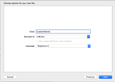
3、Storyboard 中设置
-
在 Storyboard 场景中设置
-
Button 设置
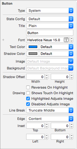
Type 按钮类型 State Config 按钮状态 Title 按钮文字 Font 按钮文字字体 Text Color 按钮文字颜色 Shadow Color 按钮文字阴影颜色 Image 按钮图片 Background 按钮背景图片 Shadow Offset 按钮阴影偏移量 -- Reverses On Highlight Drawing -- Shows Touch On Highlight -- Highlighted Adjusts Image 高亮状态图片不变暗 -- Disabled Adjusts Image 禁用状态图片不变暗 Line Break 断行方式 Edge 边距类型设置 Inset 内边距大小设置 -
Control 设置
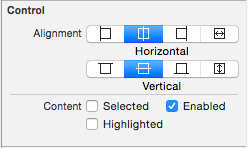
Alignment 文字对齐方式 Content -- Selected 选中 -- Enable 可用 -- Highlighted 高亮
-
4、UIButton、UIImageView、UILabel 的选择
-
特点:
- UIButton:
- 既能显示文字,又能显示图片(能显示 2 张图片,背景图片和内容图片)。
- 长按高亮的时候可以切换图片\文字。
- 直接通过 addTarget... 方法监听点击。
- UIImageView:
- 能显示图片,不能直接通过 addTarget... 方法监听点击。
- UILabel:
- 能显示文字,不能直接通过 addTarget... 方法监听点击。
- UIButton:
-
选择:
- 仅仅是显示数据,不需要点击
- 建议选择 UIImageView、UILabel。
- 不仅显示数据,还需要监听点击
- 建议选择 UIButton。
- 其实 UIImageView、UILabel 也可以通过手势识别器来监听。
- 建议选择 UIButton。
- 长按控件后,会改变显示的内容
- 选择 UIButton
- 因为 UIButton 有 highlighted 这种状态。
- 选择 UIButton
- 同时显示 2 张图片:背景图片、内容图片
- 选择 UIButton。
- 仅仅是显示数据,不需要点击
5、UIButton 子控件
-
1、不要直接拿出按钮内部的子控件,来修改文字、图片属性,按钮内部的子控件设置是有状态的。
-
直接拿出设置时无法显示
self.imageView.image = [UIImage imageNamed:@"shop.icon"]; self.titleLabel.text = shop.name; -
带状态设置时才能正常显示
    self setImage:[UIImage imageNamed:shop.icon] forState:UIControlStateNormal];
    [self setTitle:shop.name forState:UIControlStateNormal];
-
-
2、子控件 frame 设置
    self.imageView.frame = CGRectMake(0, 0, buttonW, imageH);
    self.titleLabel.frame = CGRectMake(0, imageH, buttonW, buttonH - imageH);
// 设置按钮中 title 的尺寸 - (CGRect)titleRectForContentRect:(CGRect)contentRect { return CGRectMake(0, 30, 70, 30); }// 设置按钮中 imageView 的尺寸 - (CGRect)imageRectForContentRect:(CGRect)contentRect { // 计算 imageView 控件尺寸,contentRect 为按钮的尺寸 CGFloat W = 40; CGFloat H = 46; CGFloat X = (contentRect.size.width - W) * 0.5; CGFloat Y = 20; return CGRectMake(X, Y, W, H); } -
3、子控件 接收点击事件的区域 设置
    // 设置按钮接收点击事件的区域
    - (UIView *)hitTest:(CGPoint)point withEvent:(UIEvent *)event {

        CGFloat btnW = self.bounds.size.width;
        CGFloat btnH = self.bounds.size.height;

        // 计算不接收点击事件的区域
        CGFloat X = 0;
        CGFloat Y = btnH / 2;
        CGFloat W = btnW;
        CGFloat H = Y;
        CGRect rect = CGRectMake(X, Y, W, H);

        if (CGRectContainsPoint(rect, point)) {
            return nil;
        } else {
            return [super hitTest:point withEvent:event];
        }
    }