原文 http://www.cnblogs.com/codealone/archive/2013/06/04/3091325.html
面板Panel
Ext.panel.Panel拓展自Ext.container.Container,它可以应用布局(默认为AUTO)也可以作为各种组件 的容器,并且可以拓展出更加强大的面板。作为标准的面板组件包括5部分,底部工具栏(bottom toolbars)、顶部工具栏(top toolbars)、面板头部(header)、面板底部(footer)和面板体(body),面板组件还内置了折叠、展开和关闭等功能。下面是一个标 准面板的示例:


<html>
<head>
    <title>标准面板(Panel)</title>
    <meta http-equiv="Content-Type" content="text/html; charset=utf-8">
    <script src="../ext-4.0/bootstrap.js"></script>
    <script src="../ext-4.0/locale/ext-lang-zh_CN.js"></script>
    <link href="../ext-4.0/resources/css/ext-all.css" rel="stylesheet" />
    <script type="text/javascript">
        Ext.onReady(function () {
            Ext.create('Ext.panel.Panel', {
                title: '面板头部(header)',
                tbar: ['顶端工具栏(top toolbars)'],
                bbar: ['底端工具栏(bottom toolbars)'],
                height: 200,
                collapsible: true,
                collapseDirection: 'left',
                width: 300,
                frame: true,
                renderTo: Ext.getBody(),
                bodyPadding: 5,
                bodyStyle: 'background-color:#FFFFFF',
                html: '面板体(body)',
                tools: [
                    { id: 'toggle' },
                    { id: 'close' },
                    { id: 'maximize' }
                ],
                buttons: [{
                    text: '面板底部(footer)'
                }]
            });
        });
    </script>
</head>
<body style="margin: 10px"></body>
</html>
使用items向面板中添加组件
通过使用items配置项不但可以向面板中添加组件,还可以实现面板的多层嵌套,由于items既可以接受单个对象,也可以接受数组为参数,下面将提供2个示例。
<html>
<head>
    <title>标准面板(Panel)</title>
    <meta http-equiv="Content-Type" content="text/html; charset=utf-8">
    <script src="../ext-4.0/bootstrap.js"></script>
    <script src="../ext-4.0/locale/ext-lang-zh_CN.js"></script>
    <link href="../ext-4.0/resources/css/ext-all.css" rel="stylesheet" />
    <script type="text/javascript">
        Ext.onReady(function () {
            Ext.create('Ext.panel.Panel', {
                title: '单一组件',
                height: 200,
                collapsible: true,
                collapseDirection: 'left',
                width: 300,
                frame: true,
                renderTo: Ext.getBody(),
                bodyPadding: 5,
                bodyStyle: 'background-color:#FFFFFF',
                tools: [
                    { id: 'toggle' },
                    { id: 'close' },
                    { id: 'maximize' }
                ],
                items: [//向面板中添加一个日历组件
                    {
                        xtype: 'datepicker',
                        mindate: new Date()
                    }
                ]
            });
        });
    </script>
</head>
<body style="margin: 10px"></body>
</html>
<!DOCTYPE html>
<html xmlns="http://www.w3.org/1999/xhtml">
<head>
    <meta http-equiv="Content-Type" content="text/html; charset=utf-8">
    <script src="../ext-4.0/bootstrap.js"></script>
    <script src="../ext-4.0/locale/ext-lang-zh_CN.js"></script>
    <link href="../ext-4.0/resources/css/ext-all.css" rel="stylesheet" />
    <script>
        Ext.onReady(function () {
            Ext.create('Ext.panel.Panel',
                {
                    title: '嵌套',
                    height: 500,
                    width: 500,
                    renderTo:Ext.getBody(),
                    frame:true,
                    items: [
                        //添加嵌套面板
                        {
                            title: '面板一',
                            items: [
                                {
                                    xtype: 'datepicker'
                                }
                            ]
                        },
                        //添加嵌套面板
                        {
                            title: '面板二',
                            items: [
                                {
                                    xtype:'datepicker'
                                }
                            ]
                        }
                    ]
                });
        });
    </script>
</head>
<body>

</body>
</html>
面板相当于一张干净的白纸,如果直接在白纸上添加内容,很难控制内容显示位置,面板元素越多则越混乱,所以需要在面板上划分不同的区域,将面板内容展示到希望的位置上。ExtJS提供了多种布局方式来为面板提供支持,主要包括以下11种:
Auto 自动布局 CheckboxGroup 复选框组布局 Fit 自适应布局 Column 列布局 According 折叠布局 Tables 表格布局
Card 卡片式布局 Border 边框布局 Anchor 锚点布局 Box 盒布局 Absolute 绝对位置布局
下面介绍下每种布局的特点以及使用方式。
Auto 自动布局
Ext.layout.container.Auto 自动布局是指容器在没有指定布局方式时采用的默认布局类型,它使用原始的HTML文档流来布局子元素,并把子元素调用传递到子容器中,对应面板布局配置项的名称为Auto。
之前添加演示通过items添加组件的例子中,默认使用的就是Auto布局。
<!DOCTYPE html>
<html xmlns="http://www.w3.org/1999/xhtml">
<head>
    <meta http-equiv="Content-Type" content="text/html; charset=utf-8" />
    <script src="../ext-4.0/bootstrap.js"></script>
    <script src="../ext-4.0/locale/ext-lang-zh_CN.js"></script>
    <link href="../ext-4.0/resources/css/ext-all.css" rel="stylesheet" />
    <script>
        Ext.onReady(function () {
            Ext.create('Ext.panel.Panel',
                {
                    title: 'Auto布局',
                    height: 500,
                    width: 500,
                    frame: true,
                    renderTo: Ext.getBody(),
                    items: [
                        {
                            title: '面板1',
                            html: '111111'
                        },
                        {
                            title: '面板2',
                            html: '22222'
                        }
                    ]
                });
        });
    </script>
</head>
<body>
</body>
</html>
Fit 自适应布局
Ext.layout.container.Fit 是布局的基础类,对应面板布局配置项的名称为Fit,Fit布局将使唯一的子元素充满容器,如果当前容器中有多个子面板,则只有第一个会被显示。
<!DOCTYPE html>
<html xmlns="http://www.w3.org/1999/xhtml">
<head>
    <meta http-equiv="Content-Type" content="text/html; charset=utf-8" />
    <script src="../ext-4.0/bootstrap.js"></script>
    <script src="../ext-4.0/locale/ext-lang-zh_CN.js"></script>
    <link href="../ext-4.0/resources/css/ext-all.css" rel="stylesheet" />
    <script>
        Ext.onReady(function () {
            Ext.create('Ext.panel.Panel',
                {
                    title: 'Fit布局',
                    width: 500,
                    height: 500,
                    frame: true,
                    renderTo: Ext.getBody(),
                    layout: 'fit',
                    items: [
                        {
                            title: '面板1',
                            html: '11111111111'
                        },
                        {
                            title: '面板2',
                            html: '2222222222'
                        }
                    ]
                });
        });
    </script>
</head>
<body>
</body>
</html>
Accordion 折叠布局
Ext.layout.container.According折叠布局,对应的面板布局配置项名称为Accordion,该布局包含多个子面板,任何时候只有一个子面板处于打开状态,每个子面板都内置了对展开和收缩功能的支持。
<!DOCTYPE html>
<html xmlns="http://www.w3.org/1999/xhtml">
<head>
    <meta http-equiv="Content-Type" content="text/html; charset=utf-8" />
    <script src="../ext-4.0/bootstrap.js"></script>
    <script src="../ext-4.0/locale/ext-lang-zh_CN.js"></script>
    <link href="../ext-4.0/resources/css/ext-all.css" rel="stylesheet" />
    <script>
        Ext.onReady(function () {
            Ext.create('Ext.panel.Panel',
                {
                    title: 'accordion布局',
                    width: 500,
                    height: 500,
                    frame: true,
                    renderTo: Ext.getBody(),
                    layout: 'accordion',
                    items: [
                        {
                            title: '面板1',
                            html: '11111111111'
                        },
                        {
                            title: '面板2',
                            html: '2222222222'
                        }
                    ]
                });
        });
    </script>
</head>
<body>
</body>
</html>
Card卡片式布局
Ext.layout.ontainer.Card对应的面板布局配置项名称为Card。该布局会包含多个子面板,任何时候只有一个子面板处于 显示状态,这种布局经常应用于制作向导和标签页。该布局的重点方法是setActiveItem,因为一次只能显示一个面板,所以切换子面板的唯一途径就 是调用SetActiveItem,它接受一个子面板的id或者索引作为参数。Card布局并没有提供一个子面板的导航机制,导航逻辑需要自己处理。
<!DOCTYPE html>
<html xmlns="http://www.w3.org/1999/xhtml">
<head>
    <meta http-equiv="Content-Type" content="text/html; charset=utf-8" />
    <script src="../ext-4.0/bootstrap.js"></script>
    <script src="../ext-4.0/locale/ext-lang-zh_CN.js"></script>
    <link href="../ext-4.0/resources/css/ext-all.css" rel="stylesheet" />
    <script>
        Ext.onReady(function () {
            var panel = Ext.create('Ext.panel.Panel',
                  {
                      title: 'card布局',
                      width: 500,
                      height: 500,
                      frame: true,
                      renderTo: Ext.getBody(),
                      layout: 'card',
                      items: [
                          {
                              title: '面板1',
                              html: '11111111111'
                          },
                          {
                              title: '面板2',
                              html: '2222222222'
                          },
                           {
                               title: '面板3',
                               html: '33333333'
                           }
                      ],
                      buttons: [
                          {
                              text: '上一页',
                              handler: changePanel
                          },
                          {
                              text: '下一页',
                              handler: changePanel
                          }
                      ]
                  });
            var index = 0;
            function changePanel(btn) {
                if (btn.text == '上一页') {
                    index -= 1;
                    if (index < 0) {
                        index = 0;
                    }
                }
                else {
                    index += 1;
                    if (index > 2) {
                        index = 2;
                    }
                }
                panel.layout.setActiveItem(index);
            }
        });
    </script>
</head>
<body>
</body>
</html>
Anchor锚点布局
Ext.layout.container.Anchor是根据容器大小为其所包含的子面板进行定位的布局。对应面板配置项的名称为 Anchor。如果容器大小发生变化,所有子面板的位置都会根据规则重新计算,并自动渲染。使用Anchor布局时需要注意以下配置的使用:
anchorSize(父容器提供)
Anchor布局提供了anchorSize配置项类设置虚拟容器的大小,默认情况下Anchor布局是根据容器自身大小来计算定位的,如果提供了anchorSize属性则Anchor布局就会根据该尺寸生成一个虚拟容器,然后根据这个虚拟容器的大小计算定位。
anchor(子容器提供)
加入到使用Anchor布局面板中的子面板也支持anchor配置项,它只是一个包含2个值的字符串:水平值和垂直值,例如,“50% 20%”,这个值告知父容器应该怎样为加入到其中的子面板进行定位,有效值包括百分比、偏移值、参考边。
<!DOCTYPE html>
<html xmlns="http://www.w3.org/1999/xhtml">
<head>
    <meta http-equiv="Content-Type" content="text/html; charset=utf-8" />
    <script src="../ext-4.0/bootstrap.js"></script>
    <script src="../ext-4.0/locale/ext-lang-zh_CN.js"></script>
    <link href="../ext-4.0/resources/css/ext-all.css" rel="stylesheet" />
    <script>
        Ext.onReady(function () {
            Ext.create('Ext.panel.Panel', {
                title: 'Anchor布局',
                height: 500,
                width: 500,
                frame: true,
                layout: 'anchor',
                renderTo: Ext.getBody(),
                items: [
                    {
                        anchor: '30% 30%',
                        title: '百分比Percentage设定',
                        html: '百分比Percentage设定'
                    },
                    {
                        anchor: '200 300',
                        title: '偏移值Offsets设定',
                        html: '偏移值Offsets设定',
                        items: [{
                            anchor: 'r b',//相对于父容器的右边和底边的差值进行定位
                            width: 100,
                            height: 100,
                            title: '参考边Sides定位',
                            html: '参考边Sides定位'
                        }
                        ]
                    }

                ]
            });
        });
    </script>
</head>
<body>
</body>
</html>
Absolute 绝对位置布局
Ext.layout.container.Absolute对应的面板布局配置项的名称为Absolute,它可以根据子面板中配置的x/y坐标进行定位。
<!DOCTYPE html>
<html xmlns="http://www.w3.org/1999/xhtml">
<head>
    <meta http-equiv="Content-Type" content="text/html; charset=utf-8" />
    <title></title>
    <script src="../ext-4.0/bootstrap.js"></script>
    <script src="../ext-4.0/locale/ext-lang-zh_CN.js"></script>
    <link href="../ext-4.0/resources/css/ext-all.css" rel="stylesheet" />
    <script>
        Ext.onReady(function () {
            Ext.create('Ext.panel.Panel',
                {
                    title: 'Absolute布局',
                    width: 500,
                    height: 500,
                    frame: true,
                    renderTo: Ext.getBody(),
                    defaults: {//设置items默认属性
                        frame: true,
                        height: 70,
                        width: 70,
                        bodyStyle: 'background-color:#FFFFF;padding:15px'
                    },
                    items: [
                        {
                            x: 10,
                            y: 10,
                            html: '面板1',
                            title: '面板1'
                        },
                         {
                             x: 100,
                             y: 100,
                             html: '面板2',
                             title: '面板2'
                         }
                    ]
                });
        });
    </script>
</head>
<body>
</body>
</html>
CheckboxGroup 复选框组布局
Ext.layout.container.CheckoxGroup复选框组布局,对应面板布局配置项的名称为CheckboxGroup,它实现了按照布局表单组件Ext.Form.CheckboxGroup和Ext.form.RadioGroup的功能。
Column 列布局
Ext.layout.container.Column对应的面板布局配置项的名称为Column。这是一种多列风格的布局样式,每一列的宽 度都可以根据百分比或者固定值来进行设置,高度允许根据内容进行变化,它支持一个特殊的属性columnWidth,每一个加入到容器中的子面板都可以根 据columnWidth配置项指定百分比或者固定值来确定列宽。
columnWidth配置项是以像素为单位的固定宽度,必须是等于或者大于1的数字。
columnWidth配置项是以百分比为单位的相对宽度,必须是大于或者小于1的小数,例如 .25。
注意:所有列的columnWidth值加起来必须等于1.
<!DOCTYPE html>
<html xmlns="http://www.w3.org/1999/xhtml">
<head>
    <meta http-equiv="Content-Type" content="text/html; charset=utf-8" />
    <script src="../ext-4.0/bootstrap.js"></script>
    <script src="../ext-4.0/locale/ext-lang-zh_CN.js"></script>
    <link href="../ext-4.0/resources/css/ext-all.css" rel="stylesheet" />
    <script>
        Ext.onReady(function () {
            Ext.create('Ext.panel.Panel',
                {
                    title: 'column布局',
                    width: 500,
                    height: 500,
                    renderTo: Ext.getBody(),
                    frame: true,
                    layout: 'column',
                    items: [
                        {
                            title: '面板1',//面板1的子项使用固定值进行定位
                            columnWidth: '.5',
                            layout: 'column',
                            items: [
                                {
                                    title: '固定值1',
                                    columnWidth: 50,
                                    html:'固定值1'
                                },
                                {
                                    title: '固定值2',
                                    columnWidth: 50,
                                    html:'固定值2'
                                }
                            ]
                        },
                        {
                            title: '面板2',//演示固定定位和百分比定位结合使用
                            columnWidth: '.5',
                            layout: 'column',
                            items: [//固定值优先,即父容器的宽度减去固定定位Panel的宽度,剩下的值作为参考,在这个值的基础上,进行百分比计算
                                {
                                    title: '面板2中的固定值定位',
                                    columnWidth: 20,
                                    html: '面板2中的子面板固定值定位'
                                },
                                {
                                    title: '面板2中的百分比定位',
                                    columnWidth: .5,
                                    html: '面板2中的百分比定位11111'
                                },
                                {
                                    title: '面板2中的百分比定位',
                                    columnWidth: .5,
                                    html: '面板2中的百分比定位22222'
                                }
                            ]
                        }
                    ]
                });
        });
    </script>
</head>
<body>
</body>
</html>
Tables 表格布局
Ext.layout.ontainer.Table对应面板布局配置项的名称为Table。这种布局非常容易渲染内容到html表格中,可以指定列数(columns)、跨行(rowspan)、跨列(colspan),可以创建出复杂的表格布局。
<!DOCTYPE html>
<html xmlns="http://www.w3.org/1999/xhtml">
<head>
    <meta http-equiv="Content-Type" content="text/html; charset=utf-8" />
    <script src="../ext-4.0/bootstrap.js"></script>
    <script src="../ext-4.0/locale/ext-lang-zh_CN.js"></script>
    <link href="../ext-4.0/resources/css/ext-all.css" rel="stylesheet" />
    <script>
        Ext.onReady(function () {
            Ext.create('Ext.panel.Panel', {
                title: 'table布局',
                width: 500,
                height: 500,
                frame: true,
                renderTo: Ext.getBody(),
                layout: {
                    type: 'table',//表格布局
                    columns: 4 //设置表格布局默认列数为4列
                },
                defaults: {//设置默认属性
                    bodyStyle: 'background-color:#FFFFFF;',//设置面板体的背景色
                    frame: true,
                    width: 50,
                    height: 50
                },
                items: [
                    {
                        title: '面板1',
                        colspan: 3 //设置跨列
                    },
                    {
                        title: '面板2',
                        rowspan: '2' // 设置跨行
                    },
                    { title: '面板3' },
                    { title: '面板4' },
                    { title: '面板5' }
                ]
            });
        });
    </script>
</head>
<body>
</body>
</html>
Border 边框布局
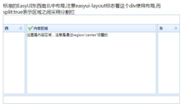
Ext.layout.container.Border对应的面板布局配置项的名称为Border。该布局包含多个子面板,是一个面向应用的 UI风格布局,它将容器划分为5个部分,分别是:east,south,west,north,center。加入到容器中的子面板需要指定region 配置项来告知要加到哪个部分,并且该布局还内置了对面板分隔栏的支持。
关于border布局有以下几点需要说明:
任何使用border布局的容器都必须有一个子元素配置为region:'center'占据中心位置,该子元素会充满布局的剩余空间;
任何占据west或east的子元素必须指定初始化宽度、flex值或者百分比字符串,center的flex值为1;
任何占据north或south的子元素必须指定初始化高度、flex值或者百分比字符串,center的flex值为1;
border布局在渲染完毕后不允许动态增加或删除子元素,如果需要必须通过附加的包装容器来操作。
<!DOCTYPE html>
<html xmlns="http://www.w3.org/1999/xhtml">
<head>
<meta http-equiv="Content-Type" content="text/html; charset=utf-8"/>
    <script src="../ext-4.0/bootstrap.js"></script>
    <script src="../ext-4.0/locale/ext-lang-zh_CN.js"></script>
    <link href="../ext-4.0/resources/css/ext-all.css" rel="stylesheet" />
    <script>
        Ext.onReady(function () {
            Ext.create('Ext.panel.Panel', {
                title: 'Ext.layout.container.Border布局示例',
                layout: 'border',//边框布局
                height: 250,
                width: 400,
                frame: true,
                renderTo: Ext.getBody(),
                defaults: {//设置默认属性
                    collapsible: true
                },
                items: [{
                    title: 'north Panel',
                    html: '上边',
                    region: 'north',//指定子面板所在区域为north
                    height: 50
                }, {
                    title: 'South Panel',
                    html: '下边',
                    region: 'south',//指定子面板所在区域为south
                    height: 50
                }, {
                    title: 'West Panel',
                    html: '左边',
                    region: 'west',//指定子面板所在区域为west
                    width: 100
                }, {
                    title: 'east Panel',
                    frameHeader: true,
                    frame: false,
                    html: '右边',
                    region: 'east',//指定子面板所在区域为east
                    width: 100
                }, {
                    title: 'Main Content',
                    html: '中间',
                    region: 'center'//指定子面板所在区域为center
                }]
            });
        });
    </script>
</head>
<body>

</body>
</html>
Box 布局
Ext.layout.container.Box盒布局又分为HBOX和VBOX 等2个子类,该布局通过子元素的flex配置项来划分父容器的空间。
<!DOCTYPE html>
<html xmlns="http://www.w3.org/1999/xhtml">
<head>
    <meta http-equiv="Content-Type" content="text/html; charset=utf-8" />
    <script src="../ext-4.0/bootstrap.js"></script>
    <script src="../ext-4.0/locale/ext-lang-zh_CN.js"></script>
    <link href="../ext-4.0/resources/css/ext-all.css" rel="stylesheet" />
    <script>
        Ext.onReady(function () {
            Ext.create('Ext.panel.Panel', {
                title: 'box布局',
                width: 500,
                height: 500,
                frame: true,
                layout: {
                    type: 'hbox',
                    align: 'stretch'
                },
                defaults: {
                    flex: 1
                },
                renderTo: Ext.getBody(),
                items: [
                    {
                        title: '面板1'
                    },
                    {
                        title: '面板2'
                    },
                    {
                        title: '面板3',
                        flex: 2,
                        layout: {//使用vbox布局子面板3
                            type: 'vbox',
                            align: 'stretch'
                        },
                        defaults:{
                            flex: 1
                        },
                        items: [
                             {
                                 title: '面板1'
                             },
                             {
                                 title: '面板2'
                             }
                        ]
                    }
                ]
            });
        });
    </script>
</head>
<body>
</body>
</html>
使用ViewPort
Ext.container.ViewPort代表浏览器窗口的整个显示区域,将document.body作为渲染对象,它会根据浏览器自身 窗口大小自动调整自身的尺寸,在一个页面中只允许有一个viewport的实例。此外它没有提供滚动条的支持,如果需要使用滚动条,还需在子面板中进行设 置。我们将之前使用boder布局的例子改写一下,使其直接渲染到整个浏览器窗口大小。
<!DOCTYPE html>
<html xmlns="http://www.w3.org/1999/xhtml">
<head>
    <meta http-equiv="Content-Type" content="text/html; charset=utf-8" />
    <title></title>
    <script src="../ext-4.0/bootstrap.js"></script>
    <script src="../ext-4.0/locale/ext-lang-zh_CN.js"></script>
    <link href="../ext-4.0/resources/css/ext-all.css" rel="stylesheet" />
    <script type="text/javascript">
        Ext.onReady(function () {
            Ext.create('Ext.container.Viewport', {
                layout: 'border',//表格布局
                items: [{
                    title: 'north Panel',
                    html: '上边',
                    region: 'north',//指定子面板所在区域为north
                    height: 100
                }, {
                    title: 'West Panel',
                    html: '左边',
                    region: 'west',//指定子面板所在区域为west
                    width: 150
                }, {
                    title: 'Main Content',
                    html: '中间',
                    region: 'center'//指定子面板所在区域为center
                }]
            });
        });
    </script>
</head>
<body>
</body>
</html>
Ext.tab.Panel页签
Ext.tab.Panel页签组件的每个tab都是一个Ext.panel.Panel,一般情况下,会有多个tab同时存在,但是同一时刻只有一个处于活动状态。
<!DOCTYPE html>
<html xmlns="http://www.w3.org/1999/xhtml">
<head>
    <meta http-equiv="Content-Type" content="text/html; charset=utf-8" />
    <title></title>
    <script src="../ext-4.0/bootstrap.js"></script>
    <script src="../ext-4.0/locale/ext-lang-zh_CN.js"></script>
    <link href="../ext-4.0/resources/css/ext-all.css" rel="stylesheet" />
    <script type="text/javascript">
        Ext.onReady(function () {
            Ext.create('Ext.tab.Panel', {
                title: 'Ext.tab.Panel示例',
                frame: true,
                height: 150,
                width: 300,
                activeTab: 1,//默认激活第一个tab页
                renderTo: Ext.getBody(),
                items: [
                    { title: 'tab标签页1', html: 'tab标签页1内容' },
                    { title: 'tab标签页2', html: 'tab标签页2内容' },
                    { title: 'tab标签页3', html: 'tab标签页3内容' },
                    { title: 'tab标签页4', html: 'tab标签页4内容' },
                    { title: 'tab标签页5', html: 'tab标签页5内容' }
                ]
            });
        });
    </script>

</head>
<body>
</body>
</html>
以上介绍中,避免篇幅过长,并没有列举出panel或者layout下的配置属性,大家有需要可以去查询ExtJs官网的API。